Handinavi Build Log.
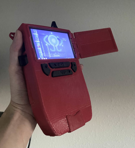
Inspired by r/unixporn and cyberdeck builds, I made my own Handinavi from Serial Experiments Lain.
| Peripherals/machines of choice: | (Free) Software used: |
| 128 GB microSD card | Raspberry Pi imager* |
| Raspberry Pi SBC | PuTTY terminal |
| Hosyond 3.5" GPIO LCD touchscreen | Autodesk Fusion 360 |
| Any offbrand micro USB cable | Gimp |
| Prusa MK4 Printer | Blender |
| Platinum 3.2 USB card reader | RPi substitute model |
| Canakit 2.5A RPi3B+ power adapter* | |
| Anker battery pack | |
* Used for first boot.
The Case.
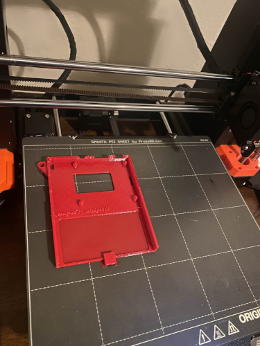
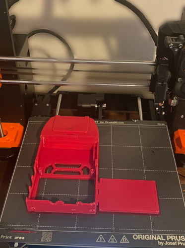
This case has gone through more than 5 revisions in a span of a week for a good reason. I'm not just making a Handinavi, but Lain's DECKED OUT Handinavi with all the upgrades and accessories made separately from the case (which would honestly be hell to put in your pocket in real life). Another limitation was the lone size of the Raspberry Pi board + GPIO screen fully assembled, which made it a whopping 3cm horizontally. For reference, the source Handinavi is only as wide as a Motorola StarTAC, or charitably the Apple Newton. I'm modeling a damn brick.
The outside shell went through so many alterations in Blender until I decided to just learn how to use Fusion 360. Can't say this aspect of making the Handinavi is exciting to explain since trial and error is a typical motion of modeling from scratch.
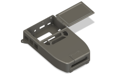
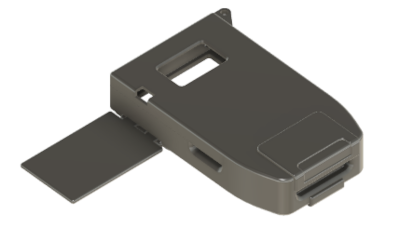
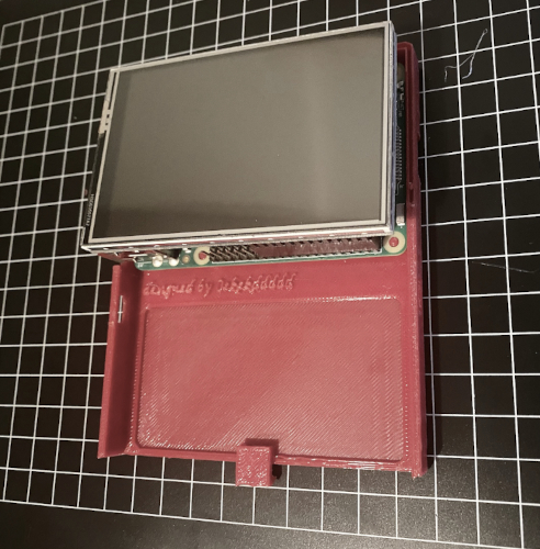
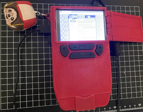
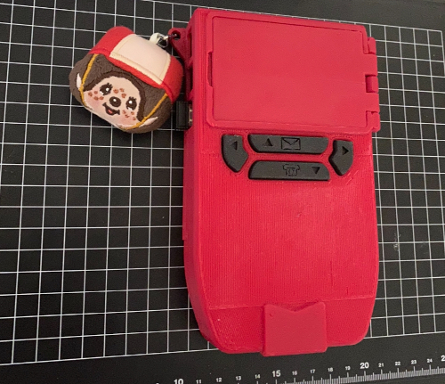
The case comes with a hinged faux trackpad, snapguides, and inserts for the accessories. I also branded my username on the inside of the case, with a level depression to make space for a power cell. The back is carved out for a adhesed pseudo-vent and a hole for the sd card to rest on. I opted out of adding snapjoints as the guides were compact enough to hold the case together.
Some parts weren't modeled like the ribbon cable sockets or the antenna steels. Instead I could just take apart old computers for these parts or get them off Adafruit online for under the price of a steak. Which is what I did.
- GPIO Ribbon Cable 2x10 IDC Cable - 20 pins 12" long
- To be added...
While functional, they don't really do much but look pretty until I figure out what to do with them to improve the build. Isn't that the art of the cyberdeck?
Rice
Before touching anything, the LCD screen and touch matrix had to be inverted so that the charger, jack, and HDMI ports are facing upwards. I also changed the display resoluton to 800 x 600 4:3 so that the taskbar and applications aren't in the way during usage.
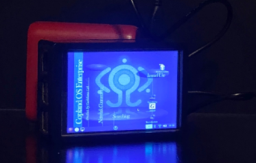
We get to see a lot of footage of what Lain's Handinavi looks like in the show. As far as I could tell... it'd be impossible to recreate it to the letter. The canonical Handinavi's applications are displayed as spherical windows that bounce around the screen, and I don't have the technical nerve to try and program that, let alone on a 1gb board. Instead, I customized it after Lain's desktop environment as seen in Layer02 and ahead.
Several artistic liberties were taken when it came to making the wallpaper because I didn't have the privilege of creating interactive tooltips or buttons. The next best thing was just to make my own theme using Gimp and Blender.

I've pretty much made everything in the wallpaper except for the fontfaces,
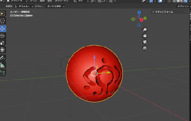
The orb graphics are just mesh presets rendered in Blender. If I scale it around, I stretch it in Gimp with interpolation set to none. I made 2 versions; one for tooltip flavor and a flat platform as seen when Lain checks her E-mail or opens applications. These assets were recycled later for the custom icon packs.
The Navi logo in the back got airbrushed a bit to emulate a sort of glowing effect, as I felt it was missing the eerie capabilities and presence of the actual Lain computer without it. Gradients are your friend. Finally, 90s anime computers aren't 90s anime computers without its scanline overlay.
I'm happy with what I ended up with. Feel free to save the wallpaper for your own 640 by 480 display.
